Load Libraries
Question 1
Create a bar chart that shows the average hours Americans spend on five activities by year. Use the timeline argument to create an animation that will animate through the years.
e_charts-1
Start with spend_time
- THEN group_by year
- THEN create an e_chart that assigns activity to the x-axis and will show activity by year (the variable that you grouped the data on)
- THEN use e_timeline_opts to set autoPlay to TRUE
- THEN use e_bar to represent the variable avg_hours with a bar chart
- THEN use e_title to set the main title to ‘Average hours Americans spend per day on each activity’
- THEN remove the legend with e_legend
Question 2
echarts-2
Create a line chart for the activities that American spend time on.
Start with spend_time
- THEN use mutate to convert year from an number to a string (year-month-day) using mutate
- first convert year to a string “201X-12-31” using the function paste
- paste will paste each year to 12 and 31 (separated by -) THEN
- THEN use mutate to convert year from a character object to a date object using the ymd function from the lubridate package (part of - the tidyverse, but not automatically loaded). ymd converts dates stored as characters to date objects.
- THEN group_by the variable activity (to get a line for each activity)
- THEN initiate an e_charts object with year on the x-axis
- use e_line to add a line to the variable avg_hours
- THEN add a tooltip with e_tooltip
- THEN use e_title to set the main title to ‘Average hours Americans spend per day on each activity’
- THEN use e_legend(top = 40) to move the legend down (from the top)
Question 3
Modify slide 82
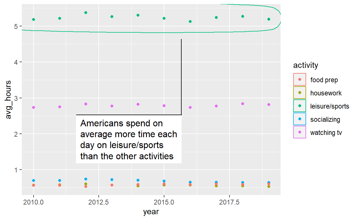
- Create a plot with the spend_time data
- assign year to the x-axis
- assign avg_hours to the y-axis
- assign activity to color
- ADD points with geom_point
- ADD geom_mark_ellipse
- filter on activity == “leisure/sports”
- description is “Americans spend the most time on leisure/sport”
ggplot(spend_time, aes(x = year, y = avg_hours, color = activity)) +
  geom_point() +
  geom_mark_ellipse(aes(filter = activity == "leisure/sports",
                        description = "Americans spend on average more time each day on leisure/sports than the other activities"))
Question 4
Modify the tidyquant example in the video
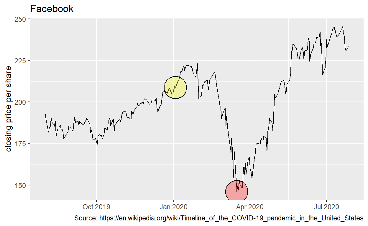
Retrieve stock price for Facebook, ticker: FB, using tq_get
- from 2019-08-01 to 2020-07-28
- assign output to df
df <- tq_get("FB", get = "stock.prices",
             from = "2019-08-01", to = "2020-07-28")
Create a plot with the df data
assign date to the x-axis
assign close to the y-axis
ADD a line with with geom_line
ADD geom_mark_ellipse
filter on a date to mark. Pick a date after looking at the line plot. Include the date in your Rmd code chunk.
include a description of something that happened on that date from the pandemic timeline. Include the description in your Rmd code chunk
fill the ellipse yellow
ADD geom_mark_ellipse
filter on the date that had the minimum close price. Include the date in your Rmd code chunk.
include a description of something that happened on that date from the pandemic timeline. Include the description in your Rmd code chunk
color the ellipse red
ADD labs
set the title to Facebook
set x to NULL
set y to “Closing price per share”
set caption to “Source: https://en.wikipedia.org/wiki/Timeline_of_the_COVID-19_pandemic_in_the_United_States”
df %>%
ggplot(aes(x = date, y = close)) +
  geom_line() +
  geom_mark_ellipse(aes(
    filter = date == "2020-01-03",
    description = "CDC Director Robert Redfield was notified by a counterpart in China that a 'mysterious respiratory illness was spreading in Wuhan [China]'; he notified HHS Secretary Alex Azar, who shared the report with the National Security Council (NSC). According to The Washington Post, warnings about the virus were included in the President's Daily Brief in early January, an indicator of the emphasis placed on the virus by the intelligence community."
    ), fill = "yellow") +
  geom_mark_ellipse(aes(
    filter = date == "2020-03-16",
    description = "President Trump issued new guidelines urging people to avoid social gatherings of more than ten people and to restrict discretionary travel. He stopped short of ordering a quarantine or a curfew, but he said restrictions may last until July or August. He acknowledged that the country may be headed for a recession. Despite the fact that the Federal Reserve Bank lowered interest rates the day prior, the stock market fell once again."
    ), fill = "red") +
  labs(
    title = "Facebook",

    x = NULL,
    y = "closing price per share",
    caption = "Source: https://en.wikipedia.org/wiki/Timeline_of_the_COVID-19_pandemic_in_the_United_States")