Load Libraries
Question 1 Modify slide 51
- Create a plot with the mpg dataset
- add points with geom_point
- assign the variable displ to the x-axis
- assign the variable hwy to the y-axis
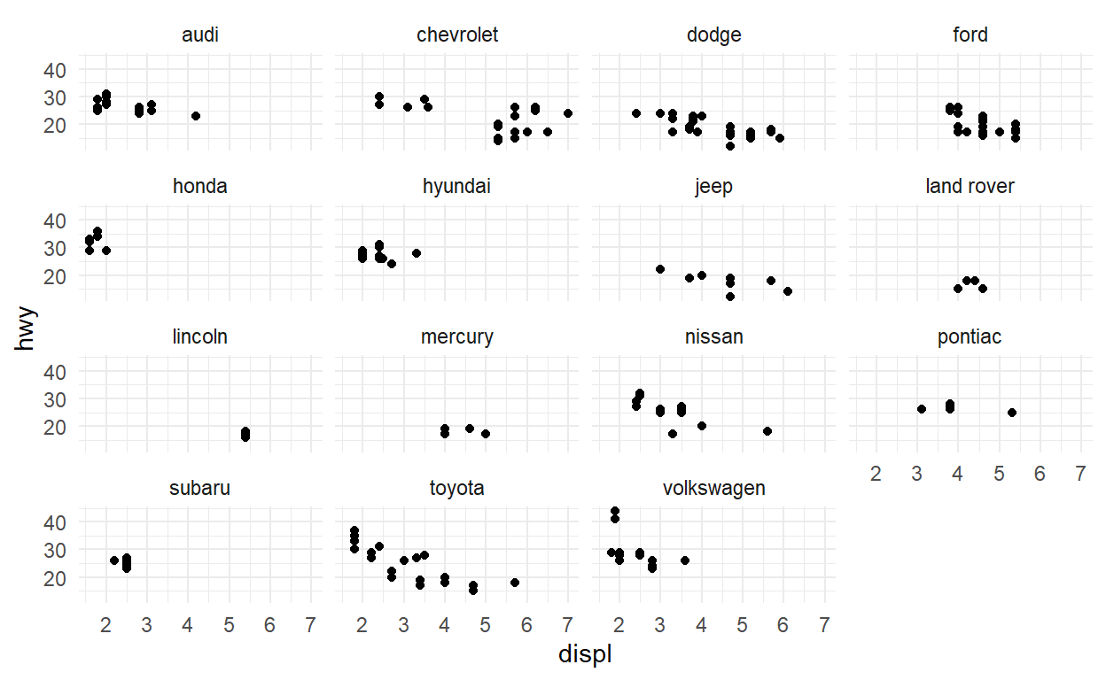
- add facet_wrap to split the data into panels based on the manufacturer
ggplot(data = mpg) +
  geom_point(aes(x = displ, y = hwy)) +
  facet_wrap(facets = vars(manufacturer))
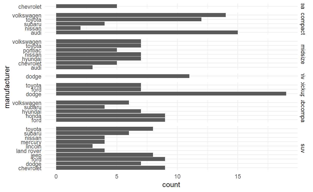
Question 2 Modify facet-ex-2
- Create a plot with the mpg dataset
- add bars with with geom_bar
- assign the variable manufacturer to the y-axis
- add facet_grid to split the data into panels based on the class
- let scales vary across columns
- let space taken up by panels vary by columns
ggplot(mpg) +
  geom_bar(aes(y = manufacturer)) +
  facet_grid(vars(class), scales = "free_y", space = "free_y")
Question 3 Spend Time
- Download the file spend_time.csv from moodle
- spend_time contains 10 years of data on how many hours Americans spend each day on 5 activities
- read it into spend_time
spend_time <- read_csv("spend_time.csv")
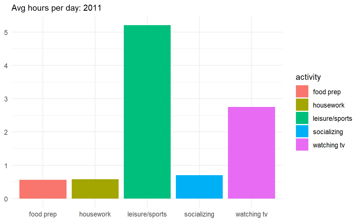
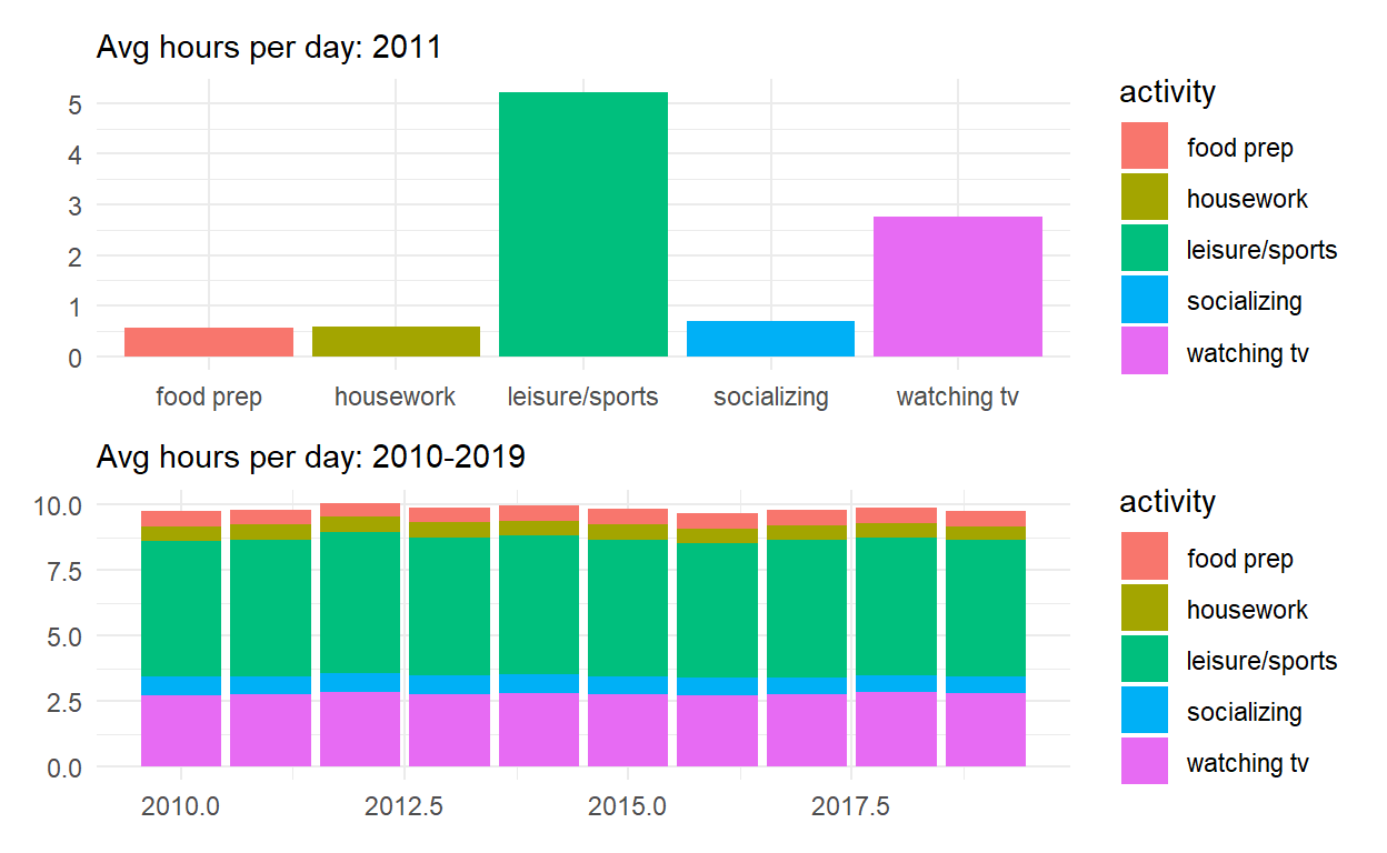
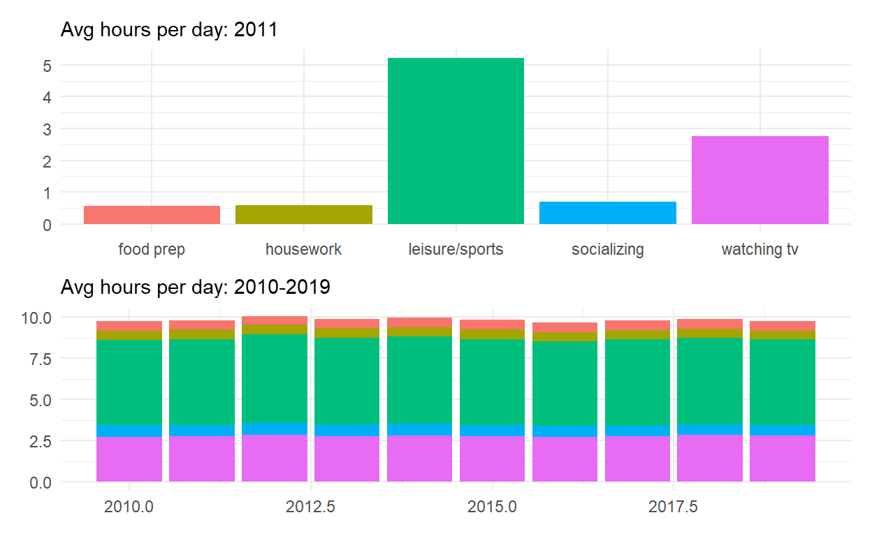
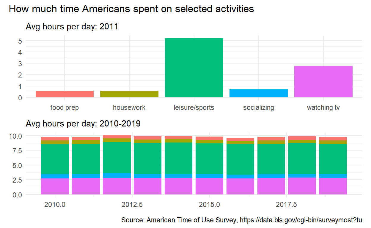
- Start with spend_time
- extract observations for 2011
- THEN create a plot with that data
- ADD a barchart with with geom_col
- assign activity to the x-axi s
- assign avg_hours to the y-axis
- assign activity to fill
- ADD scale_y_continuous with breaks every hour from 0 to 6 hours
- ADD labs to
- set subtitle to Avg hours per day: 2011
- set x and y to NULL so they won’t be labeled
- assign the output to p1
- display p1
p1 <-  spend_time %>% filter(year == "2011") %>%
  ggplot() +
  geom_col(aes (x = activity, y = avg_hours, fill = activity)) +
  scale_y_continuous(breaks = seq(0, 6, by = 1)) +
  labs(subtitle = "Avg hours per day: 2011", x = NULL, y = NULL)

p1
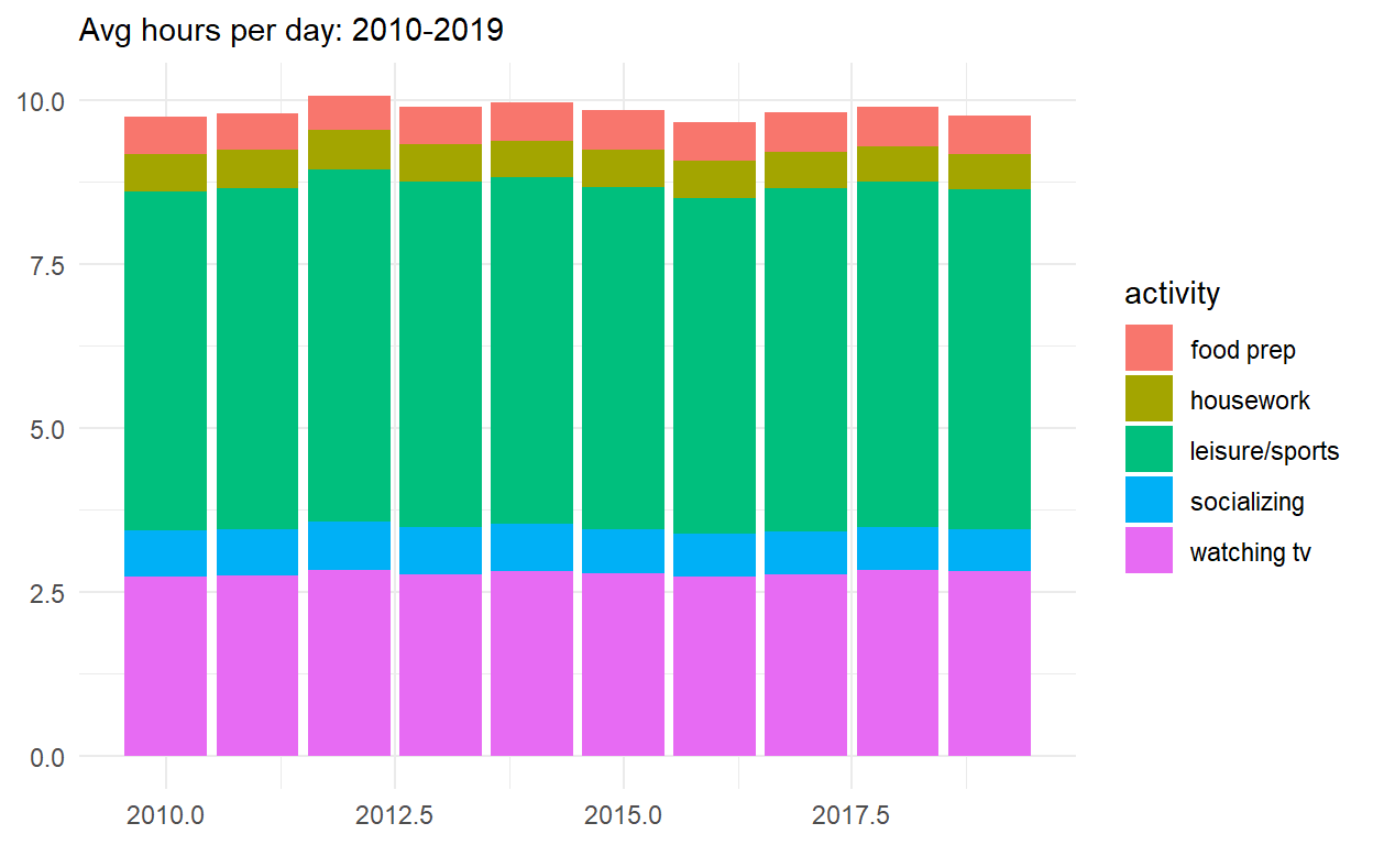
- Start with spend_time
- THEN create a plot with it
- ADD a barchart with with geom_col
- assign year to the x-axis
- assign avg_hours to the y-axis
- assign activity to fill
- ADD labs to
- set subtitle to “Avg hours per day: 2010-2019”
- set x and y to NULL so they won’t be labeled
- assign the output to p2
- display p2
p2  <- spend_time %>%
ggplot() +
  geom_col(aes(x = year, y = avg_hours, fill = activity)) +
labs(subtitle  = "Avg hours per day: 2010-2019", x = NULL, y = NULL)

p2
- Use patchwork to display p1 on top of p2
- assign the output to p_all
- display p_all
p_all <- p1/p2

p_all
- Start with p_all
- AND set legend.position to ‘none’ to get rid of the legend
- assign the output to p_all_no_legend
- display p_all_no_legend
p_all_no_legend  <- p_all & theme(legend.position = 'none')
p_all_no_legend
p_all_no_legend  +
plot_annotation(title = "How much time Americans spent on selected activities",
caption = "Source: American Time of Use Survey, https://data.bls.gov/cgi-bin/surveymost?tu")
Question 4 Patchwork 2
use spend_time from last question patchwork slides
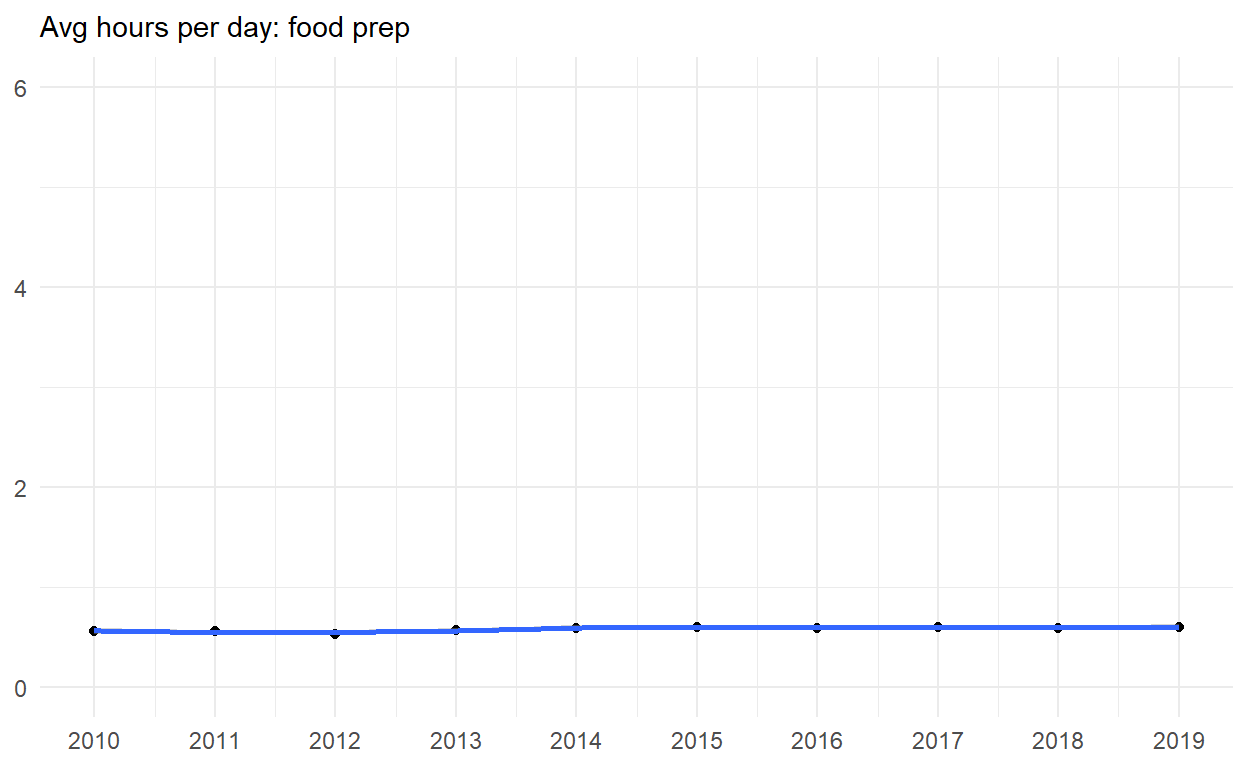
Start with spend_time
extract observations for food prep
THEN create a plot with that data
ADD points with geom_point
assign year to the x-axis
assign avg_hours to the y-axis
ADD line with geom_smooth
assign year to the x-axis
assign avg_hours to the y-axis
ADD breaks on for every year on x axis with with scale_x_continuous
ADD labs to
set subtitle to Avg hours per day: food prep
set x and y to NULL so x and y axes won’t be labeled
assign the output to p4
display p4
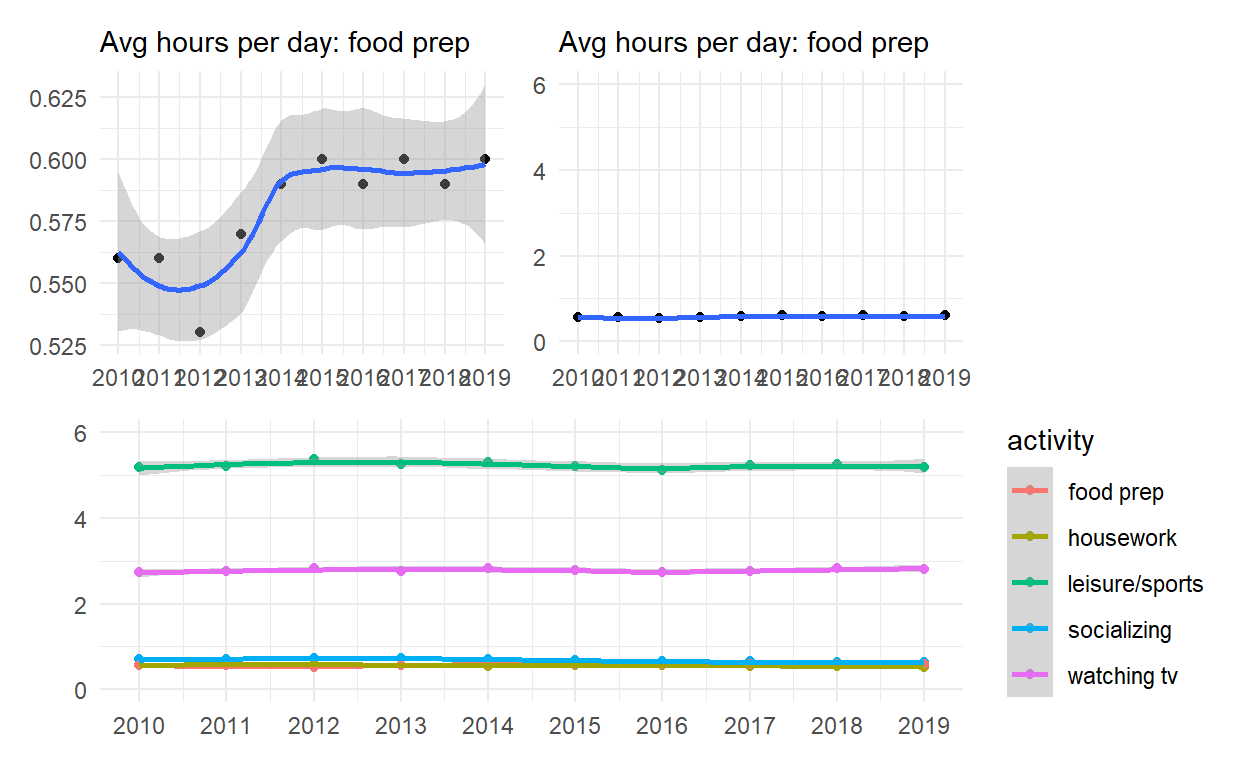
*Start with p4 - ADD coord_cartesian to change range on y axis to 0 to 6 - assign the output to p5 - display p5
p5 <- p4 + coord_cartesian(ylim = c(0, 6))

p5
*Start with spend_time - create a plot with that data - ADD points with geom_point - assign year to the x-axis - assign avg_hours to the y-axis - assign activity to color - assign activity to group - ADD line with geom_smooth - assign year to the x-axis - assign avg_hours to the y-axis - assign activity to color - assign activity to group - ADD breaks on for every year on x axis with with scale_x_continuous - ADD coord_cartesian to change range on y axis to 0 to 6 - ADD labs to - set x and y to NULL so they won’t be labeled - assign the output to p6 - display p6
p6   <-
 spend_time  %>%
ggplot() +
  geom_point(aes(x = year, y = avg_hours, color = activity, group = activity)) +
  geom_smooth(aes(x = year, y = avg_hours, color = activity, group = activity)) +
  scale_x_continuous(breaks = seq(2010, 2019, by = 1)) +
  coord_cartesian(ylim = c(0, 6)) +
  labs(x = NULL, y = NULL)

p6
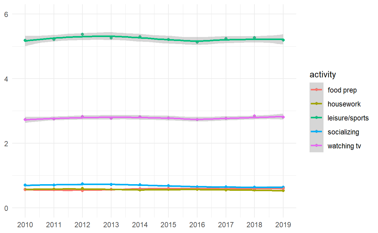
- Use patchwork to display p4 and p5 on top of p6
(p4|p5)/p6